You’re accessing archived content
This is archived content from the UIT website. Information may be outdated, and links may no longer function. Please contact stratcomm@it.utah.edu if you have any questions about archived content.
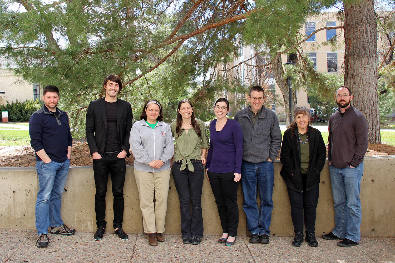
USS web team: Creating functional, feature-rich websites

What’s the purpose of a University-affiliated website? Is it primarily on online extension of a physical location, existing to attract would-be students and staff, or inform the public? Or is its central purpose communicating information to an internal audience? A little of everything?
Questions like these help the Content Management and Usability team within UIT’s University Support Services (USS) custom-build websites for various U organizations.
USS started transitioning to OmniUpdate’s (OU) OU Campus content management system in 2011, a move that enabled the strategic retirement of older systems like Vignette and HumIS. The team currently manages 150 unique domain names, with three more in the works.
OU Campus, the choice of more than 700 college and universities worldwide, is both feature-rich and intuitive, enabling web editors to learn the system quickly and manage content on their own.
“We provide [web editors] with the tool, train them, help them understand basic web functionality, support them if they have any questions, and advise them on best practices,” said Content and Usability Manager Barb Iannucci. “Some people like to be in full control, and we allow them to do that.”
While OU webpages adhere to style guidelines and templates, Iannucci’s team has considerable latitude in terms of look, feel and function. Banner width and number of columns can vary by page. Icons and small illustrative elements may be used to help clarify complex processes. Data may be presented in a chart or graph, or forms added to capture user information.
“It’s a really user-friendly system, and makes it easy for us to roll out features that our editors enjoy,” Iannucci said.
Another feature that Iannucci appreciates is that the editing environment is on a staging server, which then pushes out simple PHP pages to production servers.
“None of our websites depend on OmniUpdate to be functioning in order to function themselves,” she said. “There isn’t a complex system running behind them or database connections.”
One of the group’s newer customers is the U’s Risk & Insurance Management office. Risk Management Analyst Kristin Phillips had been maintaining the website using Adobe Dreamweaver.
“I am not a webmaster and lacked any real training, but was able to limp along and make limited changes and additions to our website,” Phillips said. “Once I heard that a University department could help transform our old domain into a new website using OmniUpdate and Google Analytics, I was very excited.”
User Experience (UX) Designer Roger Kowallis helped Phillips with the domain name, while Web Content Specialist Nic Courdy oversaw the migration of data, links and text, and developed the framework for the new site. UX Designer Lani Twitchell outlined the group’s page-by-page identity, reviewing and implementing Phillips’ suggestions for pictures and layout.
“They are all very creative and knowledgeable,” Phillips said. “I am very grateful for all their expertise … (and) I like the idea that support services are available to consult with if I have any trouble.”
When OU rolls out new features, Iannucci’s group coordinates training, in addition to offering general educational sessions like recent workshops on banners, writing for the web, and WebAIM accessibility.
Web usability, meanwhile, is creating “a cultural shift in the industry,” according to Iannucci.
“In the past, we would just rely on the technical developers to work usability into their process, but the reality is that developers have enough to do. You really need a team of people focusing specifically on users and how they interact with your software,” Iannucci said. “A lot of people are starting to use these practices more to inform their design decisions.”
UX Developer Kelsey Loizos adds “You have to collaborate with developers, and take the users into consideration along with the people who are invested in the project – and merge those three things – which can take a lot of time.”
USS recently solicited the input of students, staff and faculty for a series of user studies to improve current websites and web applications. More than 250 people responded. USS is using the pool of volunteers to test multiple websites: UIT’s Service Catalog (ServiceNow), the Campus Information System (CIS) portal, and the U’s Benefits page.
Loizos explained that information architecture – the work that goes into creating intuitive navigation – “is organizing the content in a way that’s based on how the user thinks about it.”
Said Iannucci, “Sometimes people can’t find things on websites, but that’s a problem we can solve once we have all the data.”
Iannucci recommends that those interested in a hands-on demo of OU, as well as current OU web content editors seeking new skills, schedule an in-person training session. Simply fill out this training request form.
Node 4
Our monthly newsletter includes news from UIT and other campus/ University of Utah Health IT organizations, features about UIT employees, IT governance news, and various announcements and updates.
