You’re accessing archived content
This is archived content from the UIT website. Information may be outdated, and links may no longer function. Please contact stratcomm@it.utah.edu if you have any questions about archived content.
Brand new look and feel for CIS coming this summer
Note (6/20/2017): The portal is now scheduled for release on September 8, 2017.
 Get excited: the online application you use to access everything from your paycheck
to your class schedule is finally getting a new look. The launch is targeted for July 2017.
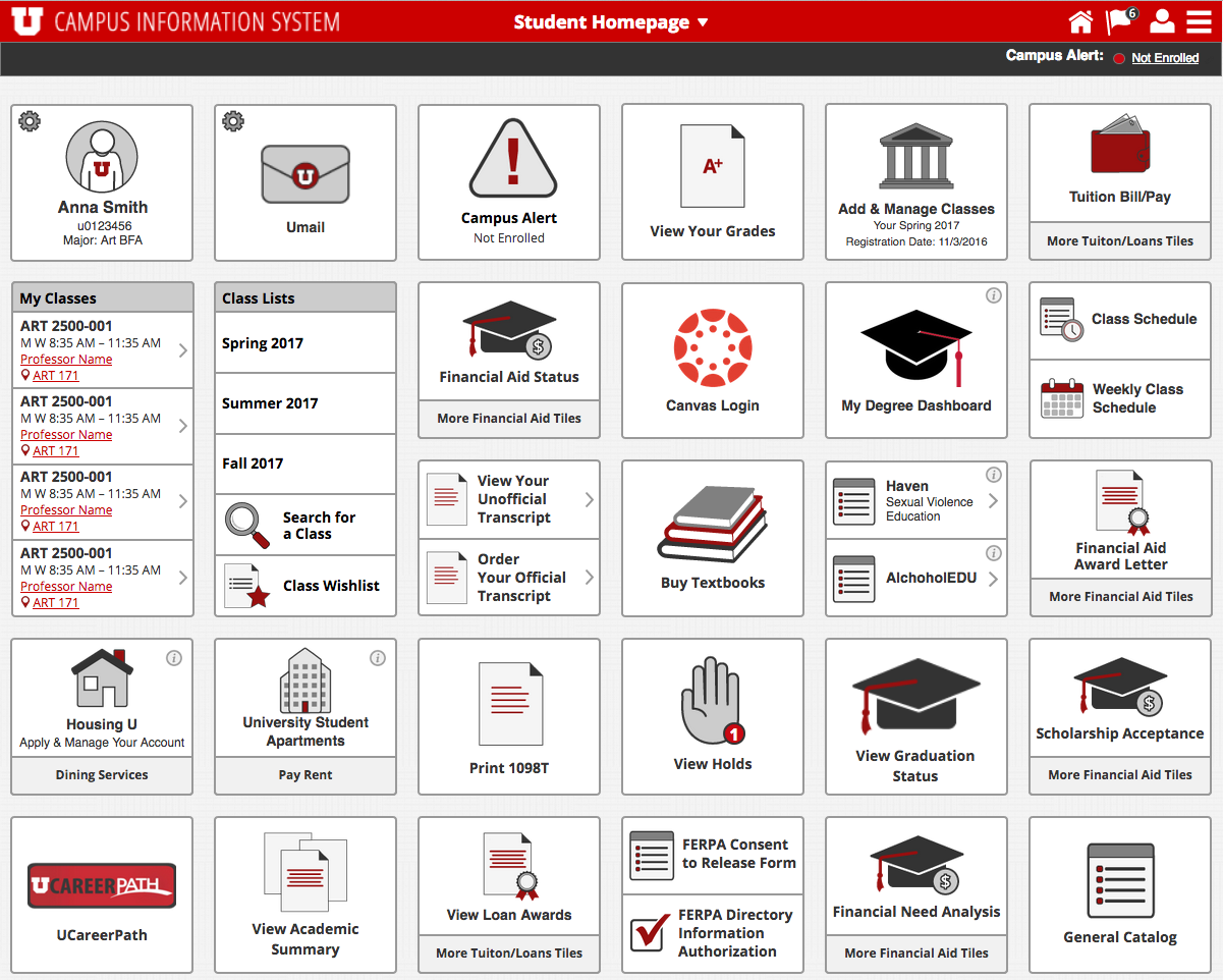
Campus Information Services (CIS) hasn’t been redesigned since 2003, and thus hasn’t aligned with today’s design standards for many years. It can be difficult to use, is non-responsive for mobile devices, and is visually cluttered, with numerous links displayed regardless of applicability to the user.
A redesign was inevitable, and a big goal with the redesign is to reduce the number of links a user sees on his or her homepage.
“Over the last nine months, we’ve been using Google Analytics to track the [link] usage in the current CIS portal,” said Mark Curtz, product manager overseeing the redesign. “We’re using that data in our new design to position the most-used applications and resources so that they’re easier to find.”
“We’ll be organizing links on homepages,” added Curtz. “We’ll be able to consolidate redundancies and give the CIS portal a modern, mobile-friendly user interface.”
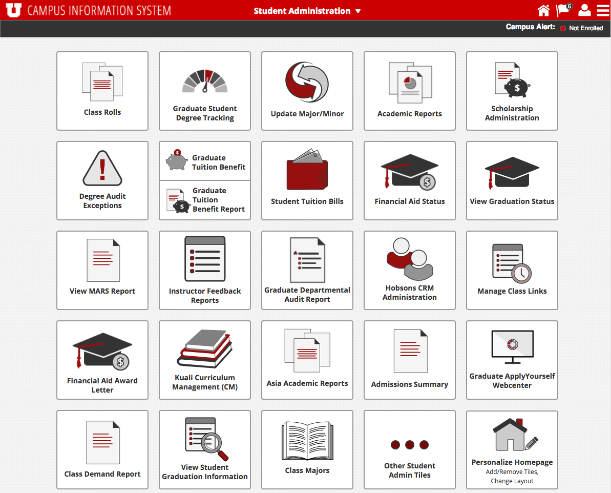
Links will display on individual tiles with intuitive icons (rather than a long, text-only list), and the homepages and subsequent tiles will be dedicated to user roles, functional areas, and common themes – for example, in addition to the Student and Employee pages, the new CIS will offer a Financial Services page with links to Finance applications, a Faculty and Research page with links to resources for professors and principal investigators, and a University Resources page with links to applications and services common to all campus users (e.g. Marriott Library, Campus Map, or Shuttle Tracker).
“We’re using the same [Google Analytics] data to identify infrequently-used links that can be optional,” said Curtz. This means users will have the ability to add or remove those link tiles on any of their existing pages. Users will also be able to create their own custom homepages with the links they use most.
“The new streamlined interface, combined with the flexibility for users to customize their pages, will make the CIS portal much easier to use,” said Curtz.
The brand new CIS will be revealed to all students, faculty, and staff this summer. See screenshots of the new look and feel below, and stay tuned for more updates as the go-live date gets closer.

Node 4
Our monthly newsletter includes news from UIT and other campus/ University of Utah Health IT organizations, features about UIT employees, IT governance news, and various announcements and updates.
