You’re accessing archived content
This is archived content from the UIT website. Information may be outdated, and links may no longer function. Please contact stratcomm@it.utah.edu if you have any questions about archived content.
New year, new look for U websites and OmniUpdate templates
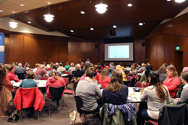
The Content Management & Usability team, led by Associate Director Barb Iannucci,
shares an update about university websites and OU Campus templates with site editors
and owners on Nov. 2, 2018
Just in time for a new year, UIT’s Content Management & Usability team has unveiled an upcoming makeover of University of Utah websites it supports in the OU Campus content management system — inside and out.
Externally, the redesign will offer a visual refresh for university websites. Internally, a new template will streamline and simplify the content management and editing experience for those using OU Campus.
Earlier this month OU website owners and editors received a first look at the changes developed by University Marketing & Communications (UMC) and implemented for OU editors by the Content Management & Usability team. It’s the first major style update in five years.
Although the team anticipates starting its first site migrations around the beginning of the year, the rollout date will continue to be a moving target as Associate Director Barb Iannucci and her team form focus groups and gather feedback.
“We want to make sure things are done right from the very start,” Iannucci said.
In the meantime, here’s some of what to expect.
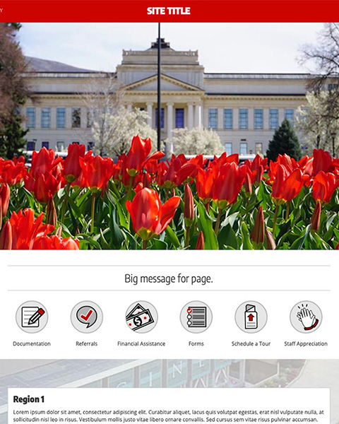
The website redesign uses bigger, bolder visuals and typography.
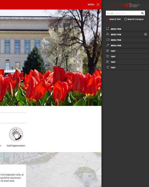
The most notable difference might be the new navigation menu, which now flies out when selected.
The user experience
It’s no secret that design plays a big part in a visitor’s overall experience and interaction with a website. But at the U, the impact of web design is much greater, as prospective and current students, parents, faculty, staff, and the general public rely on university websites to learn and share information.
The new design and templates aid in that mission by providing a fresh new look that works just as well on mobile devices as it does on desktop computers.
“We follow industry standard best practices for responsive and accessible design,” User Experience Designer Roger Kowallis said. “There has been a continued effort with the new templates toward accessibility and making them work on different platforms, across devices, and for people with different levels of ability.”
While that effort might escape immediate notice, the overall transformation toward bigger, bolder visuals and typography is readily apparent.
The most notable difference, however, might be the change to the navigation menu.
“Menu links are now located on the right side of the window and appear in a fly-out menu when the menu icon is selected,” Kowallis said.
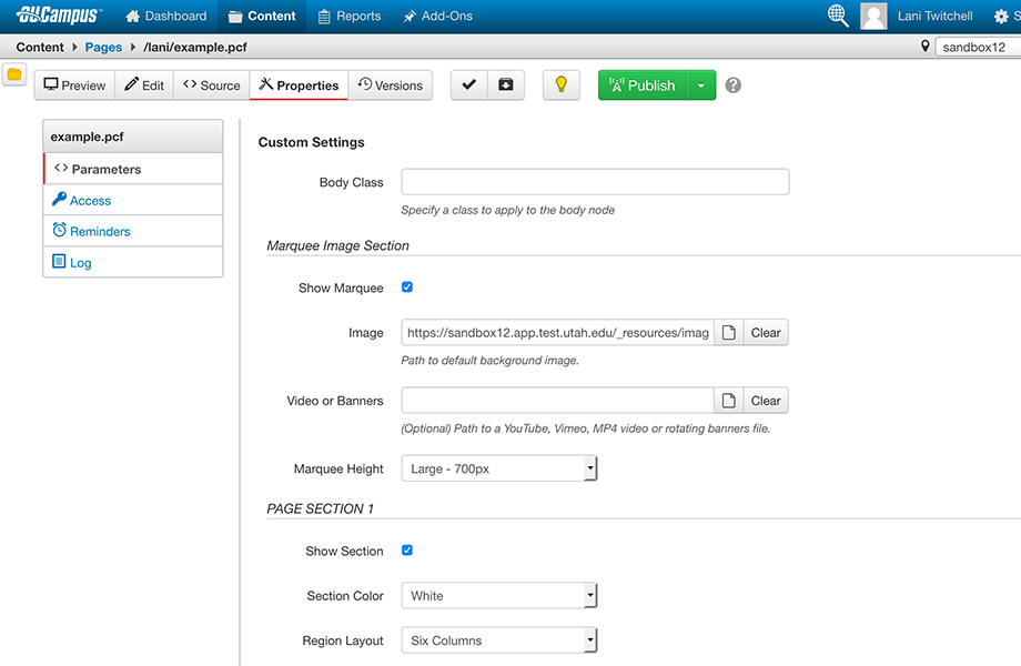
Site editors now will be able to configure more of the website layout in the page
properties.
The editor experience
With the template update, the Content Management & Usability team also seized the opportunity to improve the process of configuring, editing, and updating pages in the OU Campus content management system.
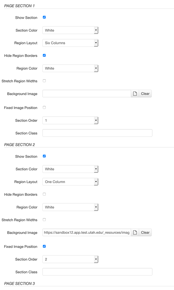
Site editors can configure multiple sections and the regions contained in each in
the page properties.
Instead of multiple templates, OU website editors now will find a single template that can be customized through the page properties. The default template offers multiple sections, with up to six regions in each, giving editors more page layout options, as well as added design elements.
“There's quite a bit you can do just in the properties for the page, and you can set that per section. It gives you a lot of flexibility when you have six regions across,” Kowallis said at the recent OU Campus update meeting.
Although many of the same snippets will be available, some have been replaced by the page configuration properties in order to simplify the editing experience.
“We changed the fundamental way you lay out your sections and your regions because we found that people were using so many snippets inside snippets inside snippets,” Iannucci said at the meeting. “This just simplifies it a lot more. Hopefully, you'll have to use actual snippets a bit less, but when you do, they won't become so nested.”
While website editors will have more control over content management and design, they won’t have to go it alone when the rollout begins — unless they want to, in which case they’ll receive training.
“My team will try to do most of the heavy lifting so you won't have to start from scratch,” Iannucci said. That includes converting all the pages built with the old template and upgrading the templates in close coordination with site managers and editors.
Indeed, with focus groups in the works, Iannucci said it will rely on the OU Campus community as it continues “to develop and further polish the experience.”
For more information about the website support services that UIT's Content Management & Usability team provides for campus:
- Visit https://websites.it.utah.edu
- Contact Barb Iannucci at barb.iannucci@utah.edu or 801-587-3637.
Features
The updated OU template brings with it some new or updated features that can be modified in the page properties. They include:
Marquee Image Section: The marquee, offered in various sizes, can contain a single image, multiple images to form rotating banners, or a video from such services as YouTube or Vimeo. The marquee can publish with or without a caption. It also can be hidden as needed.
Sections: The default template opens with three sections (think rows or horizontal bands), although site editors can add or remove as needed. Sections include a header and a footer and can contain up to six regions. Like the marquee, sections can be turned on or off. They also can be reordered, although the team says that function should be used sparingly. Editors also can select a background color or image for a particular section.
Regions: Regions (think columns) exist within sections. Editors can add up to six at a time, allowing them to modify the overall layout of the page into the number and size of columns needed.
For more information about the updated template, read this Q&A or watch the OU Campus Update presentation.
Node 4
Our monthly newsletter includes news from UIT and other campus/ University of Utah Health IT organizations, features about UIT employees, IT governance news, and various announcements and updates.
