You’re accessing archived content
This is archived content from the UIT website. Information may be outdated, and links may no longer function. Please contact stratcomm@it.utah.edu if you have any questions about archived content.
Major Maps aims to create better educational experience for U students
In mapping out their time at the University of Utah, some students might consider a degree the destination that they one day hope to reach. To get there, they need to take and pass the required courses.
As any well-worn traveler knows, though, the university experience isn’t purely a sequence of classes, but a journey filled with complementary, transformative activities and experiences that help prepare students for the path beyond their degree.
From high-impact experiences like Learning Abroad, community engagement through the Bennion Center, and undergraduate research opportunities, to resources like the Learning Center, the Career & Professional Development Center, and Student Success Advocates, the U offers many tools to help students design an exceptional educational experience. Until recently, though, it was difficult for students to find and access information about their degrees, cocurricular and extracurricular activities, and campus resources in one place.
“Our research indicates that students find it difficult to physically and virtually navigate our institution — it's huge, and that can present significant obstacles. Our websites and resources often feel disconnected, and students are having a hard time finding what they need when they need it,” said Robyn Moreno, program manager for Undergraduate Studies (UGS).
Research also indicated that U students want to find a community and anchoring connections on campus. They want to understand the connections between their courses and activities and how they relate to their educational and future pathways. Major Maps aims to begin addressing these problems.
Expanding on the goals of the Plan 2 Finish initiative, Major Maps is a one-stop digital tool, full of information curated directly by departments, to support students in “identifying, planning, navigating, and summarizing their educational experience.”
Designed by UGS faculty, staff, and students, and implemented by UIT’s Content Management & Usability team with input from a cross-campus project team and student focus groups, the website provides undergraduate students an overview of majors, complementary cocurriculars and extracurriculars, and career pathways. It provides easier access to critical resources like academic advising, counseling, financial aid, and tutoring while giving departments more control over their information and how it’s delivered.
“Major Maps puts it all in this one-stop place, so students don’t have to navigate across a bunch of different departments and places on campus.”
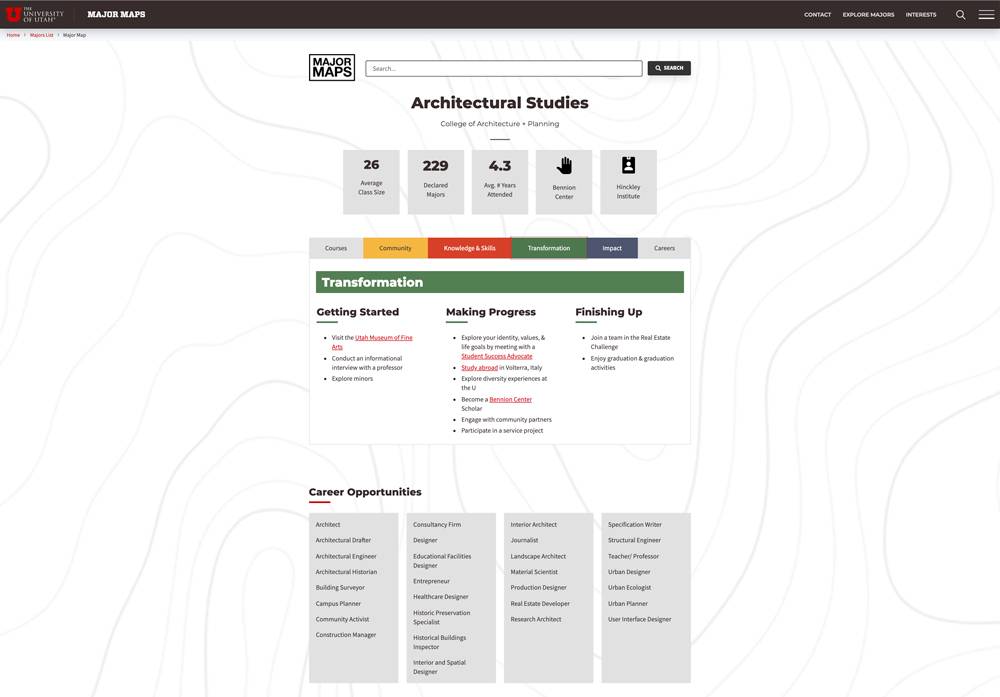
The map for Architectural Studies.
A template to support students
Major Maps draws inspiration from two sources: the U’s Exceptional Educational Experience (E3) initiative, and experiential major maps research and strategies from Education Advisory Board (EAB).
Moreno said the lesson from E3, which had been modeled on University of Utah Health’s Exceptional Patient Experience, was that the educational experience is only as good as the student thinks it is. E3 research indicated that students struggle to navigate and connect the institutions’ siloed, disparate academic and cocurricular opportunities.
“Major Maps became the first tangible tool to come from E3, designed to begin addressing what we’re learning from the E3 research,” she said.
The maps, which loosely follow an EAB template, are built around the U’s Learning Framework, Moreno said. The Learning Framework is the U’s pledge to help students become part of a community, develop the knowledge and skills they need, make an impact, and be transformed in the process.
In addition to the Learning Framework categories, course and career categories are included in each major map, which walks students through the various phases of their journey at the university — getting started, making progress, and finishing up. Additional information includes a summary of the major, learning outcomes, and potential post-degree pathways.
Students currently complete a Major Maps module during New Student Orientation; next year, they will receive information about the resource with admission materials and when they declare a major.
“We see [the maps] as something like a travel guide,” Moreno said. “Like, ‘Hey, I'm going on a trip to Europe. What's going to make this trip amazing? What should I plan for? What should I bring? What should I do and when should I do it? What do the experts suggest? What are other people on this trip doing?’ Those sorts of things. It's all built on a timeline to provide students the information they need to make intentional decisions about their educational journey.”
A promising paper pilot
In 2018, UGS launched the Major Maps pilot, featuring maps for about 25 majors. The maps, which were designed by students, could be printed (example) or posted online (example).
While the paper-based maps worked well as brochures, particularly with parents, the long-term goal was to build an interactive and intuitive interface for students, who wanted something more accessible. UGS enlisted the help of Jim Agutter, director for the Bachelor of Undergraduates program and an associate professor for the College of Architecture + Planning, whose work includes innovation and information design challenges.
“They brought me in because I work with students quite a bit and had some ideas about how we could better serve students,” said Agutter, who also is the director for the Spark Design Initiative. “So, I thought about our digital systems and how we might be able to, from a student's perspective, tie in many of the aspects of how they see their educational journey.”
When the U announced its Degree Completion Challenge in April 2019, Agutter recognized an opportunity to secure additional funding to build a digital system for Major Maps. With UGS, Agutter formed a cross-campus team that included UGS Assistant Vice President Ann Darling, Associate Dean Beth Howard, Director for Education Lyndi Duff, and Moreno; Academic Advising Center Assistant Dean John Nilsson; Digital Learning Associate Dean Cory Stokes; Teaching & Learning Technologies Director Jon Thomas; then-student Brandon Marshall; and UIT Content Management & Usability Associate Director Barb Iannucci, Product Management for Student Systems Associate Director Rachel Sheedy, and UX Developer Kelsey Loizos.
According to their proposal, a digital system for Major Maps would build on the success of the paper maps and help expand “the reach of the Plan 2 Finish initiative that has reduced time to graduation across the institution.” The tool, they wrote, would incorporate features from the existing maps, degree plans, and degree audits, and add cocurricular information.
In September 2019, the U announced that the team had won $20,000 to design and implement the digital platform (then called My Exceptional Education Experience System, or ME3S). The funding was then funneled toward the Content Management & Usability team, which administers and supports the university’s instance of Modern Campus Omni CMS, the content management system that supports UGS’ websites. The team also provides custom web development services to campus organizations.
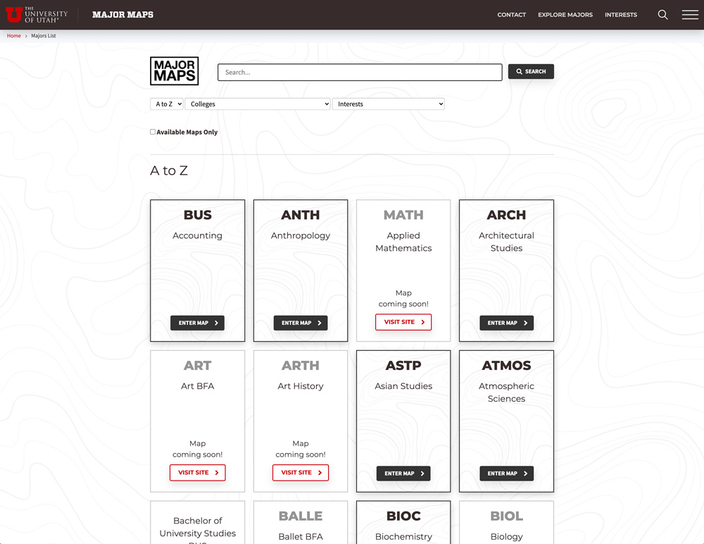
Students can view the maps by major or use filters to narrow down their interests.
Developing a One U tool
Although students drive the design and decision-making of the project, Major Maps has been a truly collaborative effort among U students, faculty, staff, and organizations.
Departments provide information for each map, with support from UGS, college liaisons, and the Career & Professional Development Center.
Brandon Marshall, a former student who now works as a program assistant for UGS, was the primary designer for the paper maps and the prototype for the website. Additionally, Agutter and Moreno said they enlisted the Student Advisory Board, focus groups, and other students for suggestions, usability testing, and feedback.
“We tried to reduce the amount of distance that we had from the design to the actual people who were consuming this data,” Agutter said.
Marshall worked closely with the Content Management & Usability team to “bring it to life,” Iannucci said. Senior Software Web Developer Shellie Eide said she “meshed [Marshall’s design] with the data in the database to generate maps for all the majors” while User Experience Designer Roger Kowallis helped adapt the design for the Omni CMS templates. Website Services Program Manager Emily Jacoby helped with the layout of version two of the website, which launched this summer.
Eide said the project could, at times, be challenging due to the differences between the initial Major Maps design and the preexisting template structure in the content management system.
“When we received Brandon’s mockups, we had to figure out how to make them work in Omni CMS templates, especially to make the site accessible and responsive. So, we had a lot of conversations about steering the design in a direction that aligned with their objectives and worked with our system,” Eide said.
When the teams encountered such issues, Agutter said Eide and her team helped them find solutions that didn’t sacrifice the student user experience.
Moreno echoed that, saying Eide and Iannucci were key in taking their ideas, envisioning what was possible, and adapting them to the framework.
“Shellie is highly skilled at taking what our students put together and translating it, while staying true to what they're trying to accomplish,” she said. “She asks the right questions, checks in when she has to shift something in a bigger way than we anticipated, and ensures that it works, all while providing great suggestions. A lot of times, she makes things work better than we initially imagined, or she has better ideas than we do. So, it's been an incredibly productive partnership for that reason.”
While the first iteration of the Major Maps website enabled students to search maps by interest and college, Moreno said “it did not allow interactivity or navigation to other resources.” With some help from Eide and Iannucci, UGS ran website analytics to determine where people did and did not spend time on the site. That data, in addition to student feedback, helped to improve the design — “to get people to the right place at the right moments with fewer clicks,” Moreno said.
For example, she said, in the current version of the tool, if a student looks at the Transformation tab in the Architectural Studies map, it suggests that they might want to learn abroad in Italy. They can learn more by selecting the “Study abroad” link, which directs them to the Learning Abroad website.
“The update was a direct response to students telling us that it's hard to find things on campus,” Moreno said. “We didn't want to provide information in one place then force them to search for it somewhere else.”
Based on what he’s seen, Agutter believes the U’s major maps not only look better than ones created by peer institutions, but they better serve students.
“Major Maps is very student-centric in the way we chunk the information, the way we sequence,” he said. “The other maps that I've seen have essentially the same components. They have links, they have descriptions, they have images, and they have some sort of structure to them. But I don't think they fit well with what a student wants.”
For example, student focus groups indicated an interest in knowing the average class size, number of declared majors, and average number of years attended. In response, UGS asked Mike Martineau, director of institutional analysis for the Offices of Budget & Planning and Institutional Analysis, for that data, which Eide added to the website and its database.
“We really tried to listen to the primary users — students — and not make assumptions about what they need to know but ask what they want to know,” Agutter said.
Databases reduce duplication
In addition to developing the website, Eide moved all the information for the maps into a UIT database and created an interface where UGS could enter and edit data for each map, which automatically reflects on the Major Maps website. She also linked the Major Maps website to a new Academic Advising Center database to pull a list of majors the U offers, reducing the duplication of data.
“The integration between the two sites is a huge step forward,” Eide said.
By creating a centralized Major Maps database, Agutter said departments control their information and decide what they want to communicate about their degrees. The data needs less day-to-day management, increasing the ability to sustain it and use it in myriad other places as intended.
“From my perspective, that allows departments to determine what they communicate and how they want to deliver it, rather than someone outside the department who doesn't necessarily have the insight and motivation to communicate an effective message that benefits the program and its students,” he said.
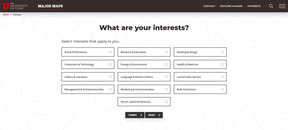
Students can also explore maps by interests, a feature that recommends majors compatible with their selections.
The road ahead
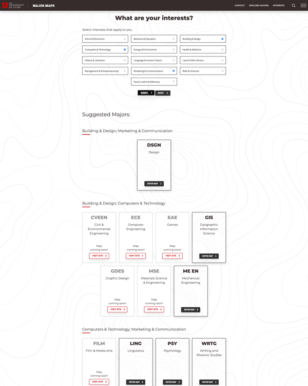
After selecting interests, students will receive suggested majors.
While Eide has been building and polishing the new Major Maps website the past few months, the rest of the team already has begun thinking of ways to improve the student experience in future versions.
There’s also an ongoing effort to finish collecting and cataloguing the information from departments about each major. Moreno estimates they’re about 75 percent complete with the U’s 110 undergraduate majors.
Down the road, Agutter envisions reconfiguring the maps to show an idealized pathway to graduation, such as a course guideline for each semester. He also sees an opportunity to reach and provide information for nontraditional students.
Above all, Moreno and Agutter said they hope to make Major Maps even more interactive, possibly even curated, designed, and streamlined to make the experience more enjoyable. Some student-driven ideas include improved navigation, additional ways to search and filter majors, integration with student profiles, and the ability to save information.
“Then it creates a cohesive digital experience and sort of facilitates a conversation so it's less like seeing a link and clicking on it, and going to an entirely different world,” Agutter said. “… We have the capabilities, we have all the right people, and I think we have all the right interest. It's just overcoming the technical burdens.”
As an example, Eide referenced the bookmark feature as one of the challenges she is trying to solve. To allow students to save maps to their student profiles, Eide would need to put the site behind authentication. That, however, would prevent unenrolled students or potential applicants, parents and guardians, and other individuals from being able to see the maps.
“Parents and guardians, for example, might want to look at the maps, to see what their students should or could be doing, so we need to make that data public. We can’t hide the whole thing,” Eide said.
Platform-specific issues, like the bookmark solution, might pose an issue in the short-term, but it’s the decentralized, university-wide issues that the team hopes Major Maps can address now and even more so in the long-term. For example, Agutter wants to continue exploring a more integrated experience for students between Degree Audit and Major Maps so they can access information about where they are on their academic journey as they move toward graduation.
But, he said, it’s been difficult to overcome some technical obstacles that would allow for that type of deep integration — although they’re making headway.
“Because of the way that we're structured, students experience a series of disjointed pieces of information that they have to put together in some meaningful ways,” he said. “Now, there's some great link aggregators like Campus Information Services (CIS). But again, from a pure experience standpoint, we have some work to do.”
Moreno and Agutter said they also plan to measure through web analytics and research studies how students interact with the maps — and adjust the site in response. Are they using the maps to find internships, learning abroad opportunities, or other cocurricular experiences? Do they use them to connect with clubs on campus? Do they better understand what their degree offers?
“We hope Major Maps helps them envision those opportunities sooner — that, before they get here, they're thinking about their educational experience as one that goes beyond a set of courses. And hopefully, the maps support them in engaging in more intentional conversations with their advisors about the educational journey.”
Whatever the feedback, the road ahead is open and full of possibilities.
Agutter attributes that not only to the emphasis on student involvement and feedback — and doing something in the best interest of students — but close collaboration with a number of campus organizations. Through their coordinated efforts, he noted that the team was able to develop and implement Major Maps using and scaling existing university resources.
“With the right people and resources,” Agutter said, “we can build some really amazing tools at our institution.”
Node 4
Our monthly newsletter includes news from UIT and other campus/ University of Utah Health IT organizations, features about UIT employees, IT governance news, and various announcements and updates.

