MobileU app redesign draws on student feedback
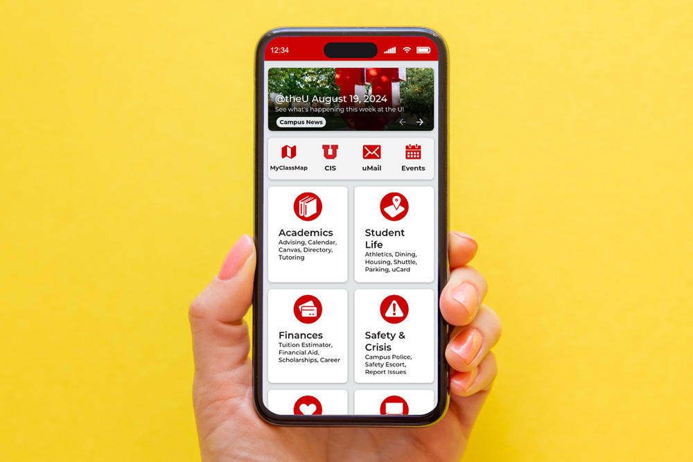
The MobileU home screen has been completely redesigned.
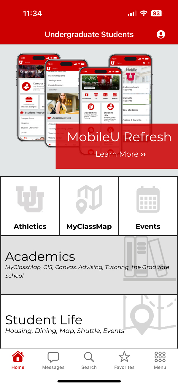
The old home screen.
Download MobileU
For more information about the app, including links to the App Store and Google Play, visit the MobileU webpage.
Over the summer, the most observant MobileU users likely noticed the addition of a search function — a popular feature request. The improvement was just the beginning, the first in a major overhaul of the University of Utah app that connects users to campus resources on the go.
On September 19, 2024, UIT’s University Support Services (USS) launched an update to MobileU that includes significant changes to the design, navigation, and organization.
Sasha Castillo, senior user experience designer for USS Web Support & Usability (WSU), worked on the upgrade for sixth months. She created a functional prototype and conducted several usability studies with about 50 participants. Students primarily commented on the appearance of the app and organization of content, Castillo said. Their feedback: MobileU felt outdated and difficult to read.
“I redesigned the app to be more contemporary, in line with university branding, and easier to read. ... For example, I displayed resources in lists, grouped information into sections, and strategically added icons and images,” she said, noting that she based all changes on student feedback, app store reviews, and app analytics.
Barb Iannucci, director for Web Support & Usability, said directly engaging with students to understand their needs is central to the MobileU team’s approach.
“By actively seeking their feedback and integrating it into our redesign process, we make sure that the mobile app truly reflects the preferences and expectations of its users,” she said.
For the most part, Castillo said, the content did not change, although she moved some links to resources from one section to another and improved section descriptions. She also changed the links to resources at the top of the home screen to represent the tools students use daily, including Campus Information Services (CIS), Events, My Class Map, and UMail. She also highlighted the three most important resources, based on student feedback, at the top of each section screen. Other screens, including Get Involved, Tools for Success, Parking & Transportation, and Report a Problem, have been updated and redesigned. The side menu, which is customizable (users can pin their favorites to the top of the menu), now features links users access the most that aren’t shown on the home screen.
“It is easier to navigate and find information, students have quick access to critical tools and most used links, and screens have been reorganized for better readability in a more logical way,” she said.
Castillo said the Technology section received the biggest update. Students indicated that some resources previously listed there made more sense in other categories (e.g., the links for the SafeUT and Shuttle Tracker apps moved to Health & Wellbeing and Parking & Transportation, respectively). Instead, the section now focuses on access to IT support and technology resources/services, including computer labs, Duo two-factor authentication (2FA), software, virtual private network (VPN), and Wi-Fi.
“The old Technology screen basically provided a list of U apps, but in card sorting usability tests, students indicated that the People Directory made more sense in the Academics section, and UMail and UCard links made more sense in Academics. I also learned that while students use RedPrint, they don’t really use University Print & Mail Services, so I took that link out,” she said. “I also added contact information for the Campus IT Help Desk and a link to the IT Knowledge Base.”
Suzanne Wayment, associate director for USS Product Management for Student Systems, is excited about the new design.
“Sasha has been amazing in her work and diligence in pursuing conversations with students to drive the direction of the app,” Wayment said. “She has gone above and beyond to learn the new capabilities offered by our vendor, Modo, and turned it into a much better experience for students.”
Castillo said she has received positive feedback from students on the redesign. “They thought it was more colorful, clear, and modern looking,” she said.
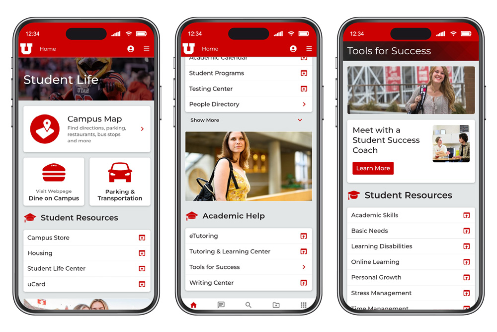
The Student Life (from left), Academics, and Tools for Success screens.
More improvements are on the way, particularly for other “experiences” or user roles, including graduate students and alumni. Until now, Castillo has focused development efforts on the new and undergraduate student experiences since incoming students are required to download the app for New Student Orientation.
“The next step is to work with appropriate groups like the Graduate School and Office of Alumni Relations to conduct research to help us develop those personas and create customized content for each one,” she said.
She encourages users to submit feedback via the app (there’s a button at the bottom of the home screen). MobileU is a work in progress, continually undergoing changes.
The goal, she said, is to make information more accessible to the university community.
“We’re trying to curate all the university’s major resources in one place, to make them easily discoverable when users need them — like My Class Map for orientation,” Castillo said. “MobileU is there to help students start a new semester, but it’s also there as a reference during the semester.”
Node 4
Our monthly newsletter includes news from UIT and other campus/ University of Utah Health IT organizations, features about UIT employees, IT governance news, and various announcements and updates.