You’re accessing archived content
This is archived content from the UIT website. Information may be outdated, and links may no longer function. Please contact stratcomm@it.utah.edu if you have any questions about archived content.
MobileU app connects students on the go to campus

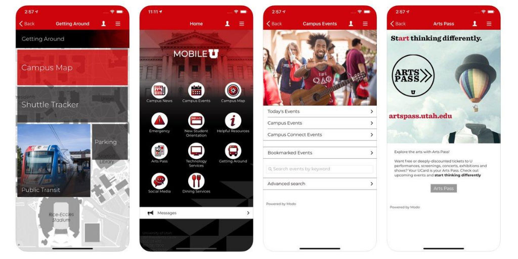
The MobileU app debuted in March 2020, becoming the university’s first centralized smartphone app. It aims to help U students connect to campus life, news, events, and resources on the go.

Barb Iannucci, associate director for USS Content Management & Usability
Email — outdated. Browser-based access to university resources — too laborious. That’s the general sentiment among today’s college students regarding digital user experience.
Generation Z — the age range of the University of Utah’s primary student cohort — expects a different user experience than their older peers. It’s all about mobile. Even then, they prefer text messages and push notifications over email, and experiences that are instantaneous and highly personalized, according to a survey by Forrester.
The MobileU app aims to meet U students where they are and help them connect to campus life, news, events, and resources on the go.
In the works for about three years, MobileU debuted in March 2020, becoming the university’s first centralized smartphone app. UIT’s University Support Services teams developed the app with support from the Integrated Student Team (IST),University Marketing & Communications (UMC), the Spark Design initiative, among other campus partners, focusing on three objectives: personalizing content, notifications, and communications; unifying and streamlining the user experience; and creating a stronger connection to the campus community.
“Students are always on their phones — that's their world,” said Barb Iannucci, associate director for USS Content Management & Usability. “We should be reaching them in the world that they live in … and curating content so they can easily access what they're interested in or what pertains to them.”
Interest for a student-driven mobile app

Ken Pink, deputy chief information officer

Kelsey Loizos, user experience developer for Content Management & Usability
The genesis for MobileU was two-fold: streamline the student experience and offer a stronger digital connection to campus, and bring together many university interests in a single space.
Deputy Chief Information Officer Ken Pink said he discovered through conversations with campus organizations a dissatisfaction with the U’s mobile app offerings and an interest in a centralized platform. UMC, for example, had noticed an influx of U-branded apps from different areas, while the Office of Admissions wanted a better mobile presence.
About the same time, the Integrated Student Team, which had been charged with providing students with a mobile platform, had formed a subcommittee to research the mobile landscape and discuss a mobile strategy.
Associate Dean for Undergraduate Studies and Digital Learning Officer Cory Stokes, who co-chairs IST, played a pivotal role in early discussions. He worked with UIT to develop a student-driven app, and helped champion the project in IST and IT governance. In fact, Stokes had invited Pink to a meeting with the vendor for MobileU, where they learned about the platform UIT eventually selected.
User Experience Developer Kelsey Loizos, who works for Content Management & Usability and had been assigned to IST’s mobile subcommittee, said her research suggested strong student support for and value in a student-driven mobile app.
Of 542 students surveyed, 54% said they definitely would download a University of Utah mobile app if it were available. Another 34% said they probably would.
“Every student I talked to was interested, for the most part, in a mobile app,” Loizos said. “They just didn't want to be overloaded. They wanted it to be more personalized because it’s on a small screen.”
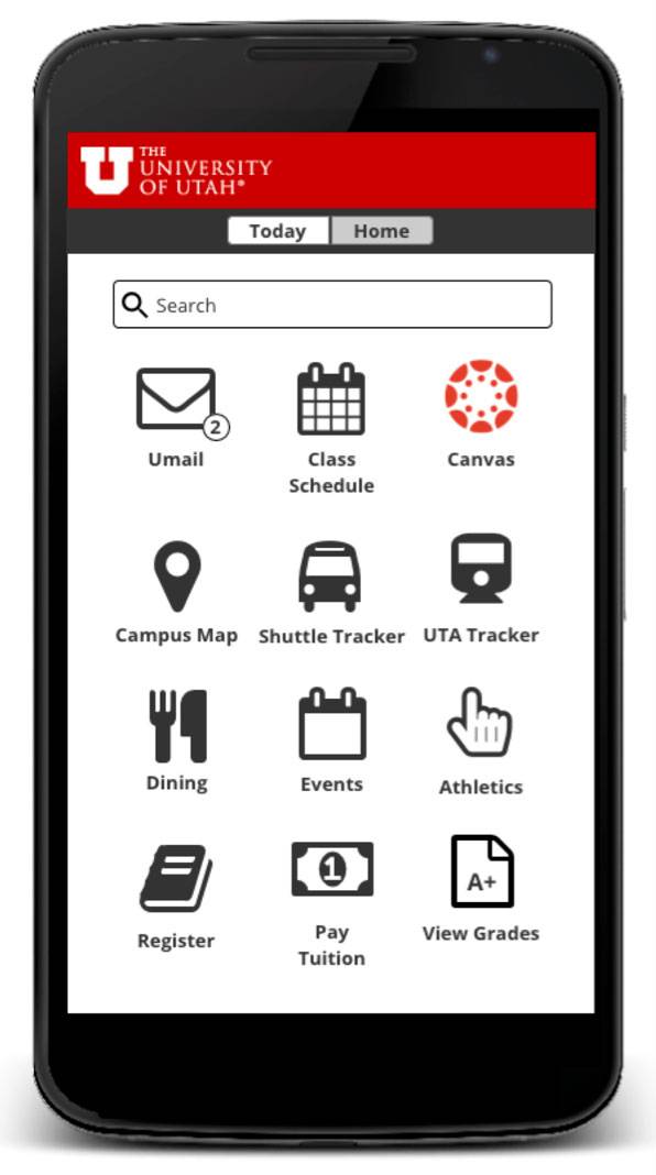
Students who reviewed a mockup of the app indicated that they liked the Canvas notifications, shuttle and UTA trackers, and easy access to UMail, the Campus Map, events, and dining.
Feedback included:
“Yes, I would download it. Everything is all right there.”
“I don’t see why I wouldn’t download it. It would be more efficient. It is easier for me to access Canvas. If I could access it all the time, it would be faster than going to the browser.”
Backed by a groundswell of interest, strong survey results, and approval from the Architecture and New Technology Committee (ANTC), Pink charged Iannucci, Associate Director for USS Product Management and Student Systems Rachael Sheedy, and their teams to select a platform and develop a product. It became their “No. 1 priority,” Sheedy said.

Rachael Sheedy, associate director for USS Product Management and Student Systems
To better understand the mobile landscape, they dived into exhaustive product research, which included reading Gartner and industry research, and consulting with other universities.
Loizos said she wanted to ensure that students would use the app — not download it and ditch it soon after. She installed and tested almost 30 apps on her phone, and read the reviews for each one to figure out what students didn’t like.
“If an app stops working, they almost immediately delete it and never come back to it,” she said. So, for example, “if something crashes constantly, they're not going to come back to it.”
The team considered different approaches, including writing an app from scratch, piggybacking off of another university’s source code, and using a plug-and-play system. A proof of concept, however, indicated that more technical frameworks would have required too many UIT resources, Iannucci and Sheedy said.
“Ultimately, we determined that Modo Labs was best suited for our environment. We made that decision because it offers a couple of things that are pretty compelling: The Modo Campus product provides a lot of out-of-the-box functionality because it has solved a lot of the higher-end mobile app needs, and they're very well-established in the higher ed space,” Sheedy said.
Iannucci noted that Modo’s prewritten modules integrate with PeopleSoft and Canvas — one of the project’s key requirements. That enables users to personalize the app, which allows UIT and its campus partners to cater content directly to different personas, Loizos said.
Modo also provides X Modules, which gives UIT the option to add any features that it develops and to provide opportunities for citizen development. The tool empowers departments to write and submit code for content they want to include in the app, without waiting on UIT to develop it, Sheedy noted.
“We knew that we didn’t have many development resources, but we also thought that we could get a lot of support for the app if people across campus could leverage it for their purposes and not have UIT be a bottleneck in that process,” Iannucci explained.
Additionally, campus partners will be able to manage their content through delegated administration. The workflow is still being hammered out, but Sheedy imagines that departments will have administrative access to make changes to their content, preview it, and send it to UIT quality assurance staff for review and publishing.
All of these features, the project team notes in its mobile strategy, should allow the university and its organizations to adopt and connect, communicate and inform, engage and enable, and scale and transform the student experience.

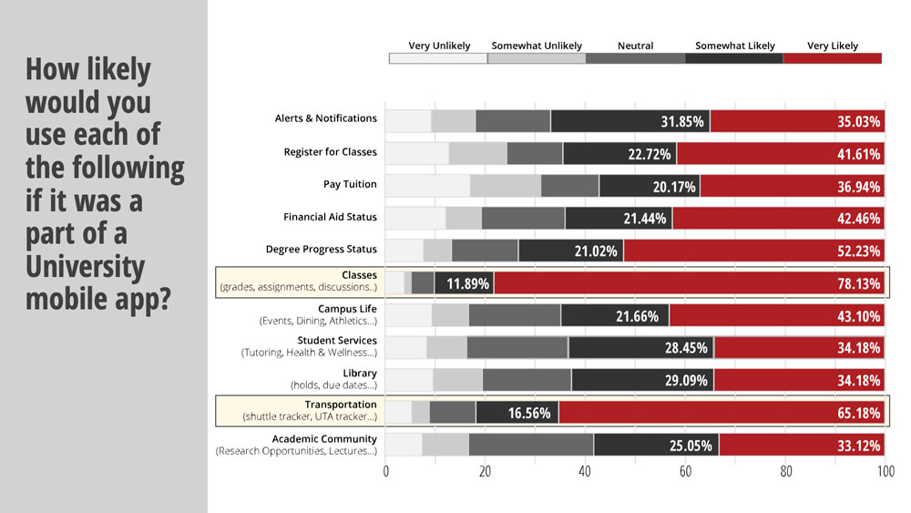
In a survey about a university mobile app, students indicated the features they'd most likely use, including classes (grades, assignments) and transportation (shuttle tracker, UTA tracker).
A grassroots effort
After selecting Modo Campus, the team got to work building out the platform. Iannucci and Loizos curated the design of the app, while Sheedy and Senior Business Systems Analyst Kariann Hibbard oversaw product and content management. Senior Software Design Engineer Brandon Gresham provided technical support, including helping with single sign-on implementation, while Software QA Specialist Scott Wilgar handled the quality assurance.
A number of campus partners also assisted the project team with research, design, focus groups, and student outreach.
“It's been a grassroots effort — it's not well-funded. We haven't taken a lot of money for it; it would go a lot faster if it had better funding,” Pink said. “But at some point, you just say, let's put what resources we can behind it, put something out there, see how people react to it, and then start making it better.”
Although Modo provides templates for the layout, the design theme is customized to align with the university’s branding and visual style. Iannucci said they would choose the best template according to the content, define the page structure and color scheme, curate imagery, and create the loading screen and graphics, etc. The home screen, for example, is entirely tailor-made for the university, Iannucci said.
Loizos, who Sheedy called a “designer extraordinaire,” created all the graphics and layouts, except for the MobileU logo, which UMC developed.
“Kelsey took a lot of my really rough screen mockups and made them pleasing to the eye,” Sheedy said. “She did some amazing work and helped establish the design standards that we're going to utilize going forward.”
The Office of Orientation & Transition was the project’s first use case and the impetus for the app’s soft rollout in March. Although the organization had an app for New Student Orientation (NSO), it wanted a platform that incoming freshman could use throughout their student journey, such as using maps to find classes, determining where to eat lunch, and getting information about campus events.
“They were able to take the money that they had been paying for a mobile app and redirect that into other services because UIT was able to provide them with those services instead of a third-party contractor,” Sheedy said.
The team also moved news and events feeds from UMC’s old platform over to MobileU and added in a module with information from the U’s COVID-19 Central.

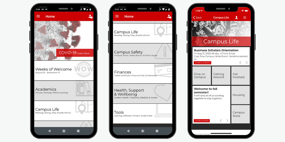
Version 2.0 of the MobileU will launch on August 30. The home page has been completely redesigned, and new features have been added.
Version 2.0
Right now, new students will find the most value in the app, Sheedy said. Work, however, continues to expand available features and to provide relevant, yet personalized, content.
“It's going to be a bit of a moving target because we are going to utilize student and user feedback and engagement metrics to help guide the product roadmap,” Sheedy said.
While priorities have included the PeopleSoft and Canvas integrations, the roadmap for Version 2.0 for students also includes modules for the academic calendar, Athletics, a Basic Needs Center, the Campus Directory, class schedules, and the UCard website. Sheedy said the Basic Needs Center, Canvas, COVID-19 Central, and UCard modules will be immediately available when Version 2.0 launches on August 30, 2020, while the others will be rolled out gradually.
Iannucci, Loizos, and other members of the Content Management & Usability team also have been working on a redesign of the home screen.
“It's going to look completely different because we're changing it based on user feedback from the initial rollout,” Iannucci said.
Users who participated in a remote focus group, for example, thought that the home screen was too busy, and went back and forth about whether it is too dark. An online survey also showed a split over dark and light redesigns.
Loizos said the update lands somewhere in the middle, with a brighter home screen and categories instead of icons for navigation.
“We figured out that it's kind of confusing, the way the app is organized. We also found that students don't really like the current home screen so we've redesigned it,” Loizos said. “… And we're hoping that's going to be a better experience.”
The new navigation also revealed loops of information, which Sheedy has been reorganizing in order to eliminate redundancies. She also redesigned the Campus Safety section, and created several new modules, including the Basic Needs Center, Tools for Success, and Get Involved.
Iannucci and Sheedy, Pink said, have done a really good job.
“Rachael has a lot of passion around the mobile app, and she puts a lot of effort into it. And Barb seems absolutely thrilled with the new user interface,” Pink said. “… It's really a nice-looking app. It brings value to the students, and it will bring more this semester.”
What the future holds
While Version 2.0 will offer much more to new and continuing students, development isn’t ending any time soon. In fact, Mobile U “is one of our top priorities and we're spending a lot of time on it,” Iannucci said.

Of the two home screens she tested, User Experience Developer Kelsey Loizos said users preferred a personalized page that featured the class schedule, assignments, and events for the day.
“We'll do continuous iterations and improvements based on the research and the usability testing that we do,” Iannucci said. “That could mean anything — from design changes to the look and feel, organization of the content, or layout of the pages, to deciding what functionality should or shouldn’t be there.”
Iannucci said her team will provide the research and usability data to IT governance committees to help them determine which features are implemented.
Based on their initial research, Iannucci and Loizos plan to pitch a daily or weekly calendar. Of the two home screens she tested, Loizos said users preferred a personalized page that featured the class schedule, assignments, and events for the day.
“We’re planning on doing a dashboard that shows your day and your to-dos — everything that's relevant to your day. That's our end vision,” Iannucci said.
Loizos said she also would like to add a feature from Orientation & Transition that allows students to upload a photo, add a bio, and introduce themselves to each other — especially now that many classes are online.
“We don't know each other anymore,” she said. “So I'm hoping eventually that module will be on the home screen and that students can say hi and share their stories and make it a truly student-based app.”
Although the app has flown somewhat under the radar, Sheedy said other campus partners are waiting in the wings. The Graduate School and S.J. Quinney College of Law are lined up to add their content to the app.
“Everyone we talked to, every time we went to a governance meeting, the interest across campus was high,” Sheedy said. “People were really excited about it.”
Node 4
Our monthly newsletter includes news from UIT and other campus/ University of Utah Health IT organizations, features about UIT employees, IT governance news, and various announcements and updates.
