You’re accessing archived content
This is archived content from the UIT website. Information may be outdated, and links may no longer function. Please contact stratcomm@it.utah.edu if you have any questions about archived content.
My Class Map helps students navigate the U campus
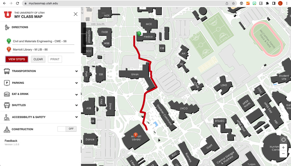
Students can use My Class Map to get directions from one class or building on campus to another.
When you’re new to the University of Utah, finding your way around campus can be daunting. Trying to do it when rushing from class to class can be chaotic and confusing. Now, a new wayfinding application is making it easier than ever for U students to find and navigate to their classes.
My Class Map enables enrolled students to access a list of their registered courses, pinpoint their locations, and get directions through the Campus Information Services (CIS) portal or by logging in to https://myclassmap.utah.edu/ with their university credentials. Students also can view other on-campus amenities, including food and drinks, parking, shuttles, public transportation, construction, and accessibility and safety resources like emergency phones and all-gender restrooms.
“Since the U is such a large campus, My Class Map is really useful in helping students — especially at the beginning of the semester or those starting their first year — navigate a university that is continuously growing,”said Vy Nguyen, GIS system administrator/developer for the GIS Team in UIT’s University Support Services Engineering. GIS is an acronym for geographic information system.
Andrea Roner, associate registrar for Student Systems & Technology for the Office of the Registrar, came up with the idea for My Class Map after seeing a presentation by Oregon State University about its class map application during an AACRAO Technology & Transfer Conference. She enlisted University Information Technology (UIT) and Facilities Management to help build it. The app launched in August 2021, before the start of the fall semester.
By September 15, 2021, My Class Map had received more than 65,000 views — “a decent amount of traffic for a young application,” according to Shane Washburn, senior software engineer for the GIS Team.
Roner wasn’t surprised by the usage data. “Our department knew that students would benefit from a class map,” she said.
Since launching My Class Map, the GIS Team has received positive feedback about the application, Washburn said.
“A couple of people have said it's nifty,” he said. “Others who have graduated already, who maybe went to school a few decades ago, said it is so much better than anything they ever had when they were a student. They wished that they had had a resource like this.”
Creating a custom-made web app
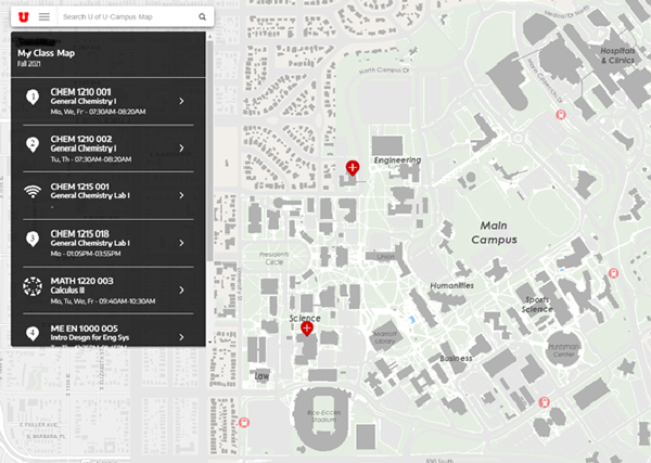
Once signed in, My Class Map shows students a list of the courses that they've registered for.
Due to certain complexities and time constraints, the team divided the project into multiple phases. The project roadmap includes three or more phases, depending on whether some of the team’s more ambitious ideas pan out.
Phase one, which moved quickly so My Class Map could launch before the start of the 2021 fall semester, focused on building a layer on top of the Campus Map to put behind the U’s central authentication system (CAS) and host the interface for the My Class Map custom web application.
Roner said authentication is necessary to comply with Family Educational Rights and Privacy Act (FERPA), under which the university classifies student class information as sensitive data. To view their classes through My Class Map, students must sign in to CAS with their university credentials.
“After logging in, the application pulls student course information to create a menu that shows their registered classes and where they are on the map,” Washburn said.
Matt Edgren, principal software engineer for the USS HR/Auxiliary Team, took on a large chunk of the work, creating a server to authenticate students and other users through CAS. USS Student Engineer Team Manager Garth DeVries and his staff built the structured query language (SQL) statement for the PeopleSoft student database. Then Nguyen — who handles all of UIT’s Esri ArcGIS infrastructure, software, and simple storage service (S3) products — connected the Student Engineer Team’s database to pull student data from the Oracle PeopleSoft student system into the geographic information system platform.
In addition to helping Edgren with the server, Washburn handled front-end development, using the data that Nguyen provided to create various features for the application. Geoff Anderson, user experience developer for the USS Content Management & Usability team, designed the app interface, determining how certain elements would appear on the screen.
Anderson created a prototype that the team used throughout the development process for iterative feedback, such as determining which icons to use or how to display different pins. One concern, Washburn noted, was that the interface would become too cluttered as they added new elements to it, particularly depending on the device or available screen space.
Roner also worried about clutter and unnecessary information. For example, the class list pulls in all the instructors associated with each class, which could potentially take up a large amount of screen space.
“If a course has 20 instructors, the student doesn’t need to see all of them,” she said. “I told the team it would be nice to have a collapsible component for classes that have more than one instructor. Then students can see the instructors they want and quickly collapse the ones they don't want."
Based on Roner’s feedback, Washburn updated the application to show a maximum of three instructors, said Conor Robertson, Student Systems & Technology manager for the Registrar’s Office.
Robertson said Washburn also had to figure out how to display classes with multiple locations, such as a course with a lab and a lecture in different buildings and/or rooms. Classes with physical locations are marked by numbered pins, representing the order in which they are listed in the menu.
“If you have a class with multiple locations, the map will display two red pins with the same number,” Robertson said. “For example, a class with a lecture in Marriott Library and lab in LNCO [the Language & Communication Building] would show No. 1 pins in both buildings.”
If multiple classes take place in the same building, a pin with a plus sign will appear at the application’s default zoom level and the numbered pins will appear after zooming in. Washburn said students also can select the class in the menu to zoom in on that course’s pin.
The team also considered which icons might best represent hybrid or online classes, and off-campus courses. Canvas courses use the vendor’s logo, while online classes use a Wi-Fi signal. Hybrid courses or those not yet finalized are marked TBA (to be announced). Off-site course locations, which include the Asia, Sandy, and St. George campuses, are denoted with a navigation sign. Washburn said the team does not have the data it needs to map out those campuses.
Running quality assurance tests
Students also can access My Class Map in MobileU.
Because the authentication component took a while to implement, the team had only about a week to run quality assurance tests on the application. Clint Bowles, QA test engineer for the USS Quality Assurance team, said he focused on mobile testing because the team expected students to use the app primarily on their smartphones. Scott Wilgar, software QA specialist and team lead for the USS Quality Assurance team, helped test the map in the MobileU smartphone app.
During the QA process, Wilgar discovered that users had to log in twice to access their class schedules — first to MobileU, then to My Class Map.
“MobileU is supposed to require a user to sign in. After that, they should be able to access any of the applications inside MobileU without needing to authenticate again,” Bowles said. The class map in MobileU is a beta version until the team can resolve the issue.
Working with Chris Strong, a GIS analyst for Facilities Management, the team also discovered a discrepancy among the datasets of spatial information for campus structures that are developed and maintained by various U organizations. DeVries and Washburn said they had to analyze and convert some of the data to reconcile the issues.
Overall, though, Robertson said the project went smoothly.
“Dan Thornley (associate director for the USS Quality Assurance and GIS teams) was good about sending us test cases,” Robertson said. “He and his team quickly fixed anything that we had issues with, like classes with multiple locations. And My Class Map went live, I think, faster than quite a bit of our other projects, which was nice.”
Mapping the app’s future
Now that My Class Map is online, the project team can focus on phase two — and Roner’s original goal of pinpointing each classroom.
“We're hoping to increase the capacity of the application to be able to drill down to a room level, where we can guide students to the exact class location in the building,” Nguyen said.
To do that, the GIS Team needs floor plan data from Facilities Management and is working closely with Strong to make this happen. The department is actively digitizing blueprints for all campus buildings, many of which have multiple floors or levels, Nguyen noted. Currently, the GIS system uses the geometry of the buildings to place pins, which is one reason why pins for different classes in the same building are stacked.
“When we're consuming the floor plan data, however, we'll be able to use the geometry and the physical location of the classroom to place the pin instead. That will, in most cases, provide a decent offset so pins don't overlap and it's easier to see them,” Washburn said.
Nguyen noted that phase two is a huge undertaking.
“This process is very involved and requires a lot of collaboration among the relevant departments in addition to extensive quality control and data validation efforts to ensure quality and accuracy,” she said.
“My Class Map will be its own tile so students can access the app quicker, straight from their Student Homepage,” she said. “It will also replace the My Classes application that went away.”
Although the team has ideas for phase three, and big ones at that, Roner said she doesn’t want to share them just yet. The plan depends on third-party integrations that may or may not be possible.
Creating a world of possibilities
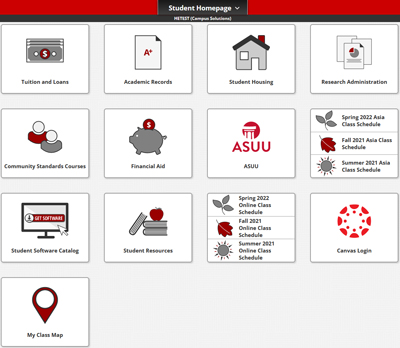
My Class Map has a tile on the CIS Student Homepage so students can access it easily.
Nguyen and Washburn noted that My Class Map was possible because GIS development and system administrator positions moved from Facilities Management to UIT a couple of years ago, enabling the team to better leverage IT resources and collaborate with campus organizations.
“This project really was possible because we moved those GIS positions, which allows us to better collaborate and integrate with other UIT groups, especially the engineering teams,” Washburn said, noting that a number of UIT units contributed to the creation of My Class Map.
DeVries praised the team’s efforts, noting that everyone worked well together to produce a student-focused application in a limited time frame.
“Once Dan and the GIS Team got involved, the project moved really fast,” he said. “They were excited about it, and I think it turned out really well.”
Nguyen agreed.
“My Class Map demonstrates the ability we have to provide really awesome and valuable products to the campus community, just based on the resources that we've been able to bring together,” Nguyen said. “It's exciting to be part of the GIS Team and seeing this type of growth happen.”
Shortly after launching the application, Nguyen and Washburn learned that some users found unexpected ways to use the Campus Map. A few reddit users, or redditors, posted on r/uofu that they’ve scrolled to various locations around the world,including Washington, D.C., and London, England. They even joked about turning their wayfinding exploits into an informal competition.
Nguyen and Washburn were amused by the game, especially since Washburn had disabled the zoom feature.
“It was hilarious,” Washburn said. “The map has an application programming interface (API) that you can use to do different things, such as centering the map on a particular point in space, but I don't know if [the redditors] knew that. … If they didn't, they were panning for quite a long time to get to where they got.”
Nguyen added, “It was quite an effort, honestly.”
Best of all, though, the posts gave the GIS developers an opportunity to promote My Class Map and talk about the university’s GIS efforts and systems.
“It’s nice to see users engaged with our applications, and it's nice to know that people are excited about these products,” Nguyen said. “... It says a lot about the reach of the My Class Map and Campus Map applications and the willingness of the campus community to use them.”
Share your feedback
The Registrar’s Office welcomes student input on My Class Map. To provide feedback, please fill out this form and select “Student Systems and Technology” under “Office Area” before selecting “Submit.”
More information
For more information about My Class Map, please visit this Registrar’s Office webpage. The webpage includes a PDF guide with login instructions and additional support materials.
Node 4
Our monthly newsletter includes news from UIT and other campus/ University of Utah Health IT organizations, features about UIT employees, IT governance news, and various announcements and updates.